Okay, we’ll admit it. Looks matter.
Not the way people look, you’re all beautiful in your own way and you don’t need to change a thing.
But when it comes to your brand, let’s be honest people are judging books by their covers.
In this case, the book is your brand.
We know a great looking brand when we see it. It makes us feel excited. It gets us to stick around longer. It draws us in. It triggers recognition. It isn’t, however, easy to achieve.
If you’ve tried to DIY your brand aesthetics, you’ve likely encountered an incongruence in your materials. Your Instagram feed doesn’t match your website, or you create a hot pink ad graphic that clashes hard with the neutral tone of many of your other assets. And font. Oh good gracious font. “Why can’t I just find that pretty handwritten look that all my favorite brands have?! This site template only gives me 10 choices!!!”
Aesthetics seem like such a small, simple piece of the puzzle, but it’s actually so easy to get wrong.
Pro Tip: Be sure to think about your ideal audience when working through these instead of only paying attention to your personal preferences.
Research
That’s right! Just like all other content you create, determining how you want your brand to look starts with research.
We highly HIGHLY recommend creating a Pinterest board around your favorite visuals. It can be anything, text-based graphics, websites, images, logos, cool paint brush strokes, landscapes. ANYTHING. If you like the way it looks, PIN IT.
When getting started with your research, take these first few steps.
- List your favorite brands (from an aesthetic standpoint).
- What do you like about them? Color, logo, fonts, photo editing, headshots.
- How do they make you feel?
- What don’t you like?
- Go to Creative Market and just start browsing. There are 1000s of things to look at.
- What sort of visual elements just make you happy? Maybe you’re big into pineapples. Or perhaps you have a thing for polka dot. Is half your wardrobe red?
- Consider what sort of decorating aesthetics you like in your home: boho, modern, mid-century, farmhouse. Even if you aren’t an interior decorator, a lot can be derived from the world you’ve created around you. Do you paint the walls bright, bold colors? Or do you prefer cool neutrals?
- Make a list of “definitely no” items. I.e. I hate yellow. I don’t like block lettering. Llamas make me so angry. Whatever you can think of that would be an absolute “nuh uh” for you, write it down.
Color Palettes
Color palettes can be a little tricky. Not everyone has an eye for what colors they like and, more importantly, what other colors go with them. Fear not though, because there are some handy ways to approach this that don’t require extreme artistic talent.
Find an Image That Represents Your Brand
If your brand was just one photo, what would it be? It can be a photo you’ve taken or one you find in stock photos that fully represents you. There’s no magic recipe for what exactly this means. Just your gut reaction to a photo that says “I really like this!”
Now, go upload it into the Canva Color Generator. Do you like what you see?
Research Color Palettes
If you can’t find that exactly right image, just research some color combos using Google. This is where some of your research above can come in handy. Enter “boho color palette” or “desert color palette” if you’re looking for clay reds and sandy tans and sage greens. Or enter your industry + color palette. For example, “Donut Shop Color Palette” or “Software Company Color Palette.”
General Search
Or you can just go on Pinterest and type in “color palettes” and start out just by looking at every combo out there and deciding what you’re drawn to.
Fonts
Fonts are a funky piece of the puzzle. There are at least three main types of fonts you’ll use on your branding pieces:
- A heading font: One you will use any time you determine something is a title, head or subhead in text.
- A body font: Most of your text will appear in this font, it tends to be a little bit more generic so that it’s easy to read.
- An accent font: This is where the fun, handwritten, script-y fonts come in. They may be a little more complex so it’s not likely to be used on a lot of text.
Just like color palettes, you can search for font combos that work well together. Not all do. But know this, if you’re designing a website or just creating a graphic in Canva, the thing that will trip up your aesthetics every time is trying to get by using only the free fonts. Sure, there’s a couple gems in templates, but you will run the risk of having images that look a lot like everyone else’s if you limit yourself to the freebies. Purchase a font or find a package of free fonts offered by a designer. Just make sure you understand the licensing agreement for how and where you can use it.
Logos
Get a designer. Get a designer. Get a designer. Get a designer.
While we’re taking a DIY approach here to most of these aesthetic areas, we have to say, for anyone who isn’t a graphic designer, creating a quality logo is a tall order.
YES, there are templates for this in Canva too. You could go that route if you want. But again, it’s possible your logo will end up looking like others’. And in this department, you want to be distinctive.
If you’re operating on a tight budget, it’s okay to look to places like Fiverr for a low-cost option. Just make sure your designer has the color palette you’re using, the font(s) you’re featuring and a good grasp on what the overall look and feel of your brand is.
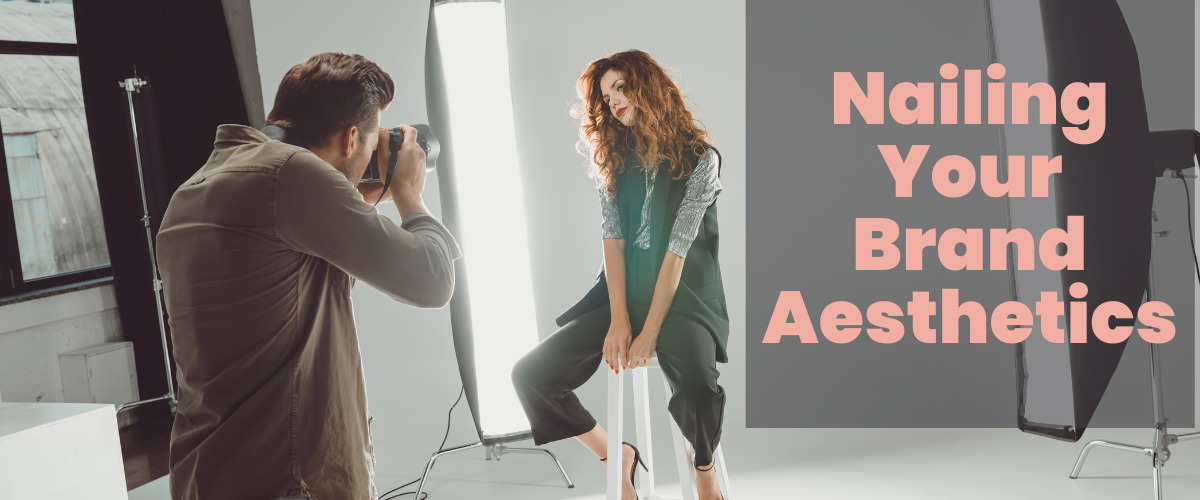
Headshots
There are a lot of ways to get a professional headshot without paying a ton for it. None of which, however, involve using your senior photos. We believe deeply in the value of timely, branded photoshoots for every business owner. A strong base of custom imagery for your company is a crucial element to the aesthetics. That being said if, for right now, you only have time and money for a good headshot, it’s worth it.
There is nothing that says “amateur” more than a grainy photo where your friend was clearly cropped out of it because your bangs look super good in that shot, so “eff it” I’m using it.
Look for Photo Deals
Sometimes, photographers will do a “flash” offering where they promise “10 headshots for $50 in a 15-minute session” or something of the sort. Follow local photographers to see if you can catch one of these.
Phone a Photog Friend
There has to be someone in your life with a quality camera and a couple minutes to spare. See if you can get a freebie using friendly trade. However, be sure not to hit up your professional photographer friends for a deal or a free session. Even your friends deserve to be paid.
Selfie + Tripod
Worst case scenario, bust out that iPhone, set up a tripod and hit the timer. It may take a few tries, but you’ll eventually get an image that feels professional and poised.
This is the image that will represent you as your business grows. It will be featured on social media profiles, website About pages, media interested in featuring you will ask for one. Your photo will be everywhere you are, make sure it’s one that represents you and your brand.
Stock Photos, Merchandise & Beyond
Your brand aesthetics will set the tone for so many things it is hard to even foresee all the ways it will come into play. It will determine what stock photos you download. It will shape the way you design labels and swag for your products. It will be on your podcast’s cover art, in your wardrobe for a photo shoot and on the cover of your book. This will trickle into everything you do and establish who you are in the mind of your followers.
It is exceedingly important to get this part right. When you combine beautiful aesthetics with killer content, you are bound to reach an interested audience.