
The Power of Color in Branding
Color palettes play a crucial role in branding, as they have the ability to evoke emotions and create associations that significantly impact how your target audience perceives your brand. Research shows that 90% of snap judgments made about products are based on color alone, while appropriate use of colors increases brand recognition by up to 80%. This demonstrates the undeniable influence of color on consumer behavior and decision-making processes.
Table of Contents
Emotional triggers evoked by colors
Impact on consumer decisions
Understanding Color Psychology for Effective Branding Strategy
Consistency Across Online and Offline Channels
Applying Color Palettes Across Marketing Materials
Logo Design Considerations
Website Color Schemes
Print Material Consistency
FAQs in Relation to Color Palettes
Conclusion
Emotional triggers evoked by colors
Different color palettes can trigger various emotional responses from people. For example, red is often associated with passion or urgency, making it an ideal choice for brands aiming to convey excitement or prompt action. On the other hand, blue exudes calmness and trustworthiness – perfect for businesses looking to establish credibility among their clientele.
Impact on consumer decisions
Studies suggest that consumers may be more likely to purchase items featuring their favorite colors or hues they associate with positive attributes (e.g., eco-friendliness). Therefore, selecting a suitable color palette for your branding efforts can directly affect potential clients’ perception and purchasing decisions regarding your products/services offered through Elly and Nora Creative’s visual identity design services.
- Bold reds: Evoke energy, passion & urgency; great for sales promotions & calls-to-action.
- Cool blues: Convey trustworthiness, stability & professionalism; ideal for financial institutions or consulting firms.
- Vibrant yellows: Communicate optimism, happiness & warmth; suitable for brands promoting positivity and well-being.
- Earthy greens: Symbolize growth, nature & sustainability; perfect for eco-friendly businesses or health-focused companies.
Using color in your branding can upgrade the look of your marketing materials, while simultaneously boosting the communication you are trying to get across. By understanding the psychology behind colors and their impact on consumer decisions, you can create an effective brand strategy that resonates with your target audience and sets you apart from competitors in today’s competitive market landscape.
The power of color in branding is undeniable; it can influence customer behavior and evoke certain emotions, making it a powerful tool for businesses to use. By comprehending the psychological aspects of hues, companies can construct successful branding plans that will assist them in distinguishing themselves from their rivals.
Understanding Color Psychology for Effective Branding Strategy
One way to develop a strategic approach towards choosing colors for your brand is by understanding the psychology behind them. Color psychology plays a significant role in branding, as different colors can evoke specific emotions and associations in consumers. Brand colors have the power to convey a brand’s personality, values, and messaging. However, it’s important to recognize that colors can have both positive and negative connotations depending on cultural influences and personal experiences. For instance, while red can symbolize energy, passion, and excitement, it can also be associated with danger or aggression. Effective branding occurs when colors are used in context, aligning with the brand’s identity and target audience. By understanding the psychological impact of colors and considering their cultural and contextual relevance, brands can leverage the power of color to create a visual identity that resonates positively with consumers, strengthens brand recognition, and fosters the desired emotional connections.
Red symbolizes passion or danger
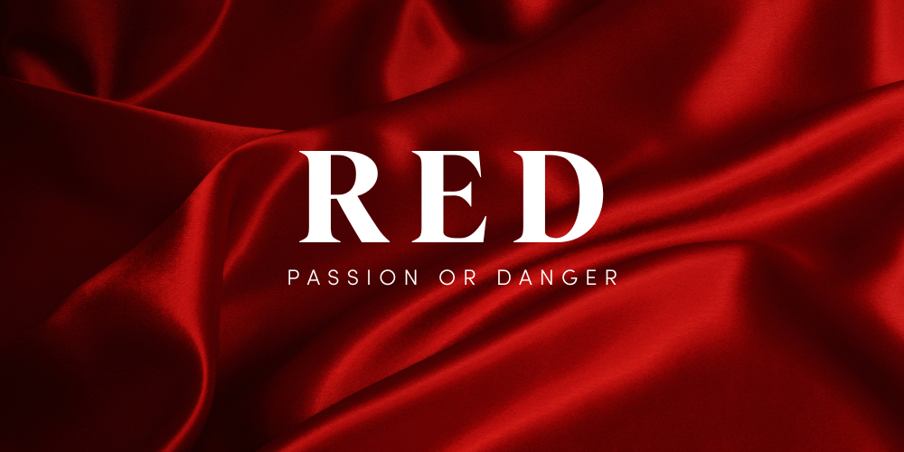
Red, often associated with energy, excitement, and love can also evoke feelings of aggression or danger. For example, using red in branding could work well for an athletic company that wants to convey power and intensity but may not be suitable for a wellness center promoting relaxation and tranquility.
Blue represents trustworthiness and stability
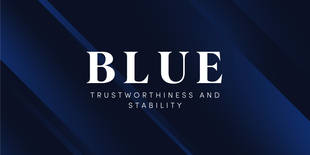
Blue, on the other hand, is commonly linked to trustworthiness, stability, and calmness – making it an ideal choice for financial institutions or technology companies seeking to project reliability and professionalism.
Green conveying growth or eco-friendliness
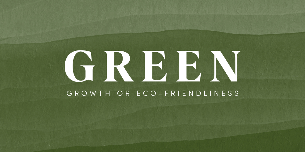
The color green, which represents growth, renewal, and nature can be perfect for businesses focusing on sustainability initiatives or health-related products/services as it communicates eco-friendliness along with positive change.
Yellow indicates optimism but also caution
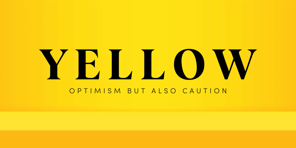
Last but not least, yellow – signifying happiness and optimism – might seem like an attractive option due to its cheerful connotations; however, it can also be associated with caution or warning signs. Therefore, businesses should carefully consider their target audience and brand message before incorporating yellow into their color palette.
Thoroughly studying the effects of color psychology on a brand’s strategy will enable you to make informed decisions when choosing hues that best reflect your company’s distinctiveness and values.
Understanding color psychology is a key element in creating an effective branding strategy. Analyzing industry trends and competitors’ visual identities can help you create a unique, differentiated identity that stands out from the crowd.
“Boost your branding game with color psychology. Understand the meanings behind colors to create a powerful visual identity that resonates with your audience. #brandingstrategy #colorpsychology”
Consistency Across Online and Offline Channels
A consistent application of your brand’s color palette ensures seamless integration between various components constituting the overall corporate image projected upon external audiences, thereby enhancing brand recognition levels. Additionally, maintaining coherence between online and offline channels guarantees a unified experience for your clients, strengthening their trust in your business.
Benefits of Cohesive Branding Efforts
- Increased brand awareness: A harmonious use of colors across all platforms helps potential customers recognize and remember your brand more easily.
- Better customer engagement: Consistent branding signals professionalism and reliability to clients, making them more likely to engage with you.
- Easier marketing management: When you have a clear visual identity established through color consistency, it simplifies the process of creating new marketing materials that align with your existing assets.
Examples of Online and Offline Channels to Consider
To achieve consistency in both online and offline environments alike, make sure to apply chosen shades throughout all marketing materials produced representing respective brands. Here are some examples where color palettes should be consistently applied:
- 1. Website design, including background colors, buttons, banners, and typography;
- 2. Social media profiles (e.g., profile pictures, background images, & post templates);
- 3. Email campaigns such as newsletters, promotional emails, and transactional messages;
- 4. Packaging materials including product packaging, shipping boxes, & labels;
- 5. Printed marketing collateral like business cards, brochures, and banners.
Incorporating your brand’s color palette consistently across these channels will lead to increased recognition rates and a more cohesive brand experience for your clients.
Creating a unified identity across digital and physical outlets can help build recognition and reliability among your patrons. Incorporating secondary and tertiary colors into your palette is an effective way to diversify the visual elements of your branding while still maintaining cohesion.
Applying Color Palettes Across Marketing Materials
Once you’ve selected suitable hues reflecting both emotional triggers aimed at evoking positive reactions among prospective customers along with industry-specific trends, it becomes necessary to determine proper ways of incorporating chosen shades throughout all marketing materials produced representing respective brands (e.g., logos/signage/website designs/etc.). Consistent application across various promotional activities undertaken in both online and offline environments alike will lead towards increased brand recognition rates.
Logo Design Considerations
Your logo design is the face of your brand and should effectively communicate your business’s personality. When selecting hues for logo design, contemplate how different shades collaborate and guarantee they supplement each other. Ensure your logo is flexible enough to be displayed on a range of backgrounds and media platforms for optimal branding and user experience.
Website Color Schemes
A cohesive website color scheme not only strengthens your branding but also enhances user experience by creating visual harmony. Choose primary colors for key elements such as headers, buttons, and links while using secondary or tertiary colors for accents or background sections. Keep accessibility in mind by ensuring sufficient contrast between text and background colors for easy readability.
Selecting complementary shades:
- – Use tools like Adobe Color CC or Coolors.co to find harmonious combinations based on color theory principles.
- – Test different options before finalizing a palette; this helps identify any potential issues early on in the process.
Print Material Consistency
Maintaining color consistency across print materials such as business cards, brochures, and banners is crucial for a unified brand identity. Be aware of the distinctions between RGB (utilized in digital design) and CMYK (used for printing); guarantee that your selected colors are accurately replicated on printed materials by converting them to their suitable CMYK values.
Key Takeaway:
To ensure increased brand recognition, it’s important to apply color palettes consistently across all marketing materials. When designing a logo, consider how different colors interact with each other and make sure the design is versatile enough for various backgrounds and mediums. Use tools like Adobe Color CC or Coolors.co to find harmonious combinations based on color theory principles when selecting complementary shades.
FAQs in Relation to Color Palettes
What colors best represent your brand?
To determine the best colors for your brand, consider the emotions and values you want to convey. Research color psychology and choose hues that evoke desired feelings in your target audience. Additionally, analyze industry trends and competitors’ visual identities to ensure differentiation while maintaining relevance.
How does the color palette of your brand reflect its values and mission?
The chosen color palette should align with your brand’s values and mission by evoking specific emotions or associations related to them. For example, blue represents trustworthiness, making it suitable for financial services brands; green convey growth or eco-friendliness, fitting for sustainable businesses.
What are some considerations when choosing a color palette for branding purposes?
When selecting a color palette, consider factors such as:
- Color psychology
- Differentiation from competitors
- Trends within your industry
- Cohesiveness across online and offline channels
- Inclusion of secondary and tertiary colors that complement primary shades
How can you ensure that your chosen color palette is consistent across all platforms?
Create a style guide outlining specific RGB/HEX codes for each hue in the selected palette. Ensure all team members have access to this guide so they can maintain consistency throughout website design, social media graphics, print materials, packaging designs, etc., thus creating cohesive branding efforts.
Are there any industry standards or trends to consider when selecting a color palette for branding purposes?
Analyze successful brands within your industry along with current design trends before finalizing a color scheme. While it’s essential not to copy competitors, you can draw inspiration from their palettes and adapt them to create a unique visual identity that resonates with your target audience.
Conclusion
In conclusion, understanding the power of color in branding and utilizing color psychology can greatly impact consumer decisions and emotional triggers. Analyzing industry trends and competitors’ visual identities, maintaining consistency across online and offline channels, incorporating secondary and tertiary colors in your palette, and applying color palettes across marketing materials are all important considerations for small to medium-sized service-based business owners and personal brands.
By implementing these strategies effectively, businesses can create a cohesive brand identity that stands out from competitors while resonating with their target audience.
If you’re looking to elevate your brand’s color palette game even further, consider working with Elly & Nora Creative – experts in creating unique visual identities that capture the essence of your business through stunning design. Reach out to us now and discover the possibilities!